


VIVAR
(creative direction, virtual photography, 3d modelisation)
(2024)
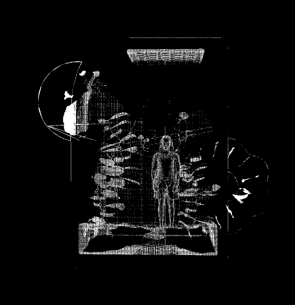
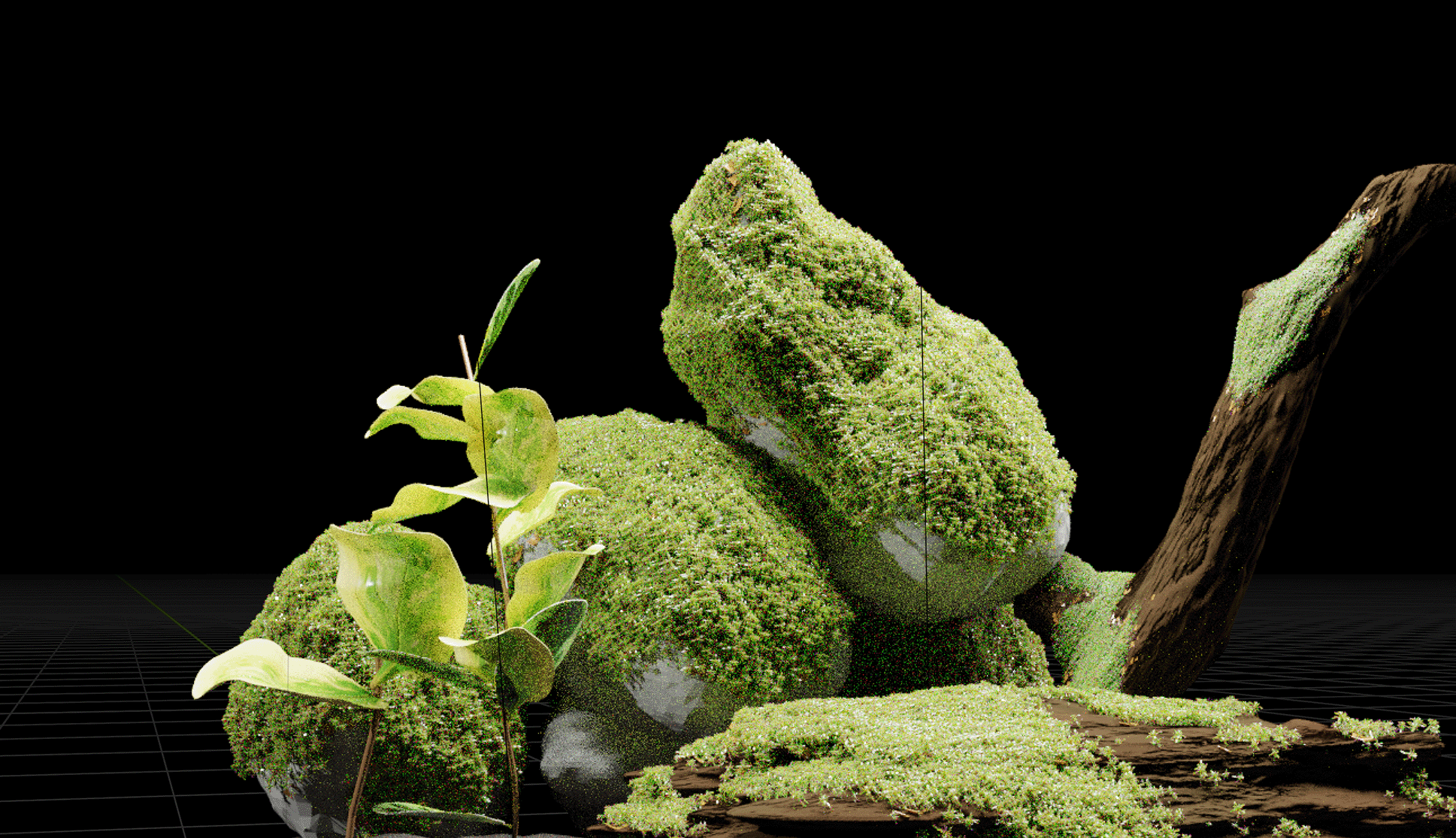
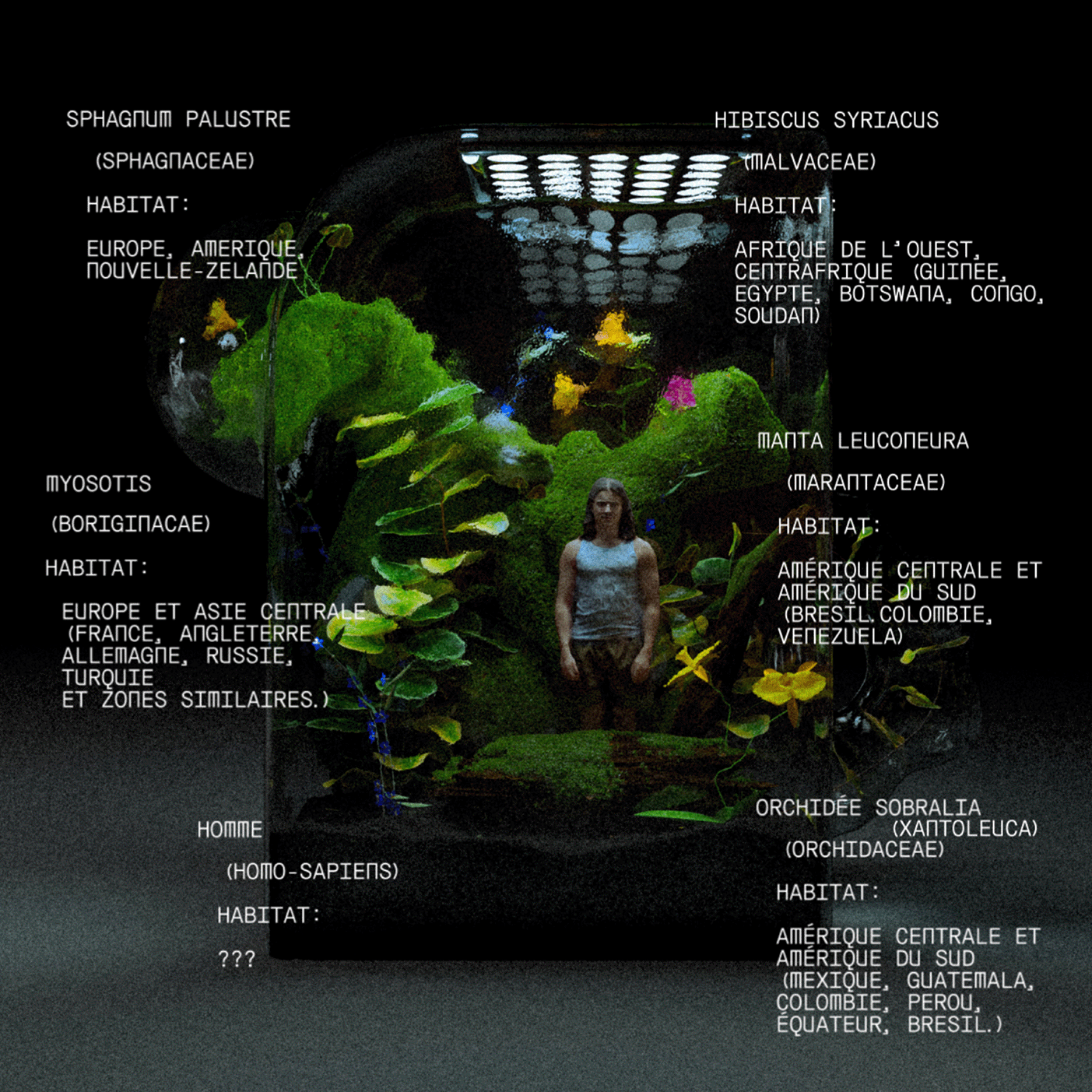
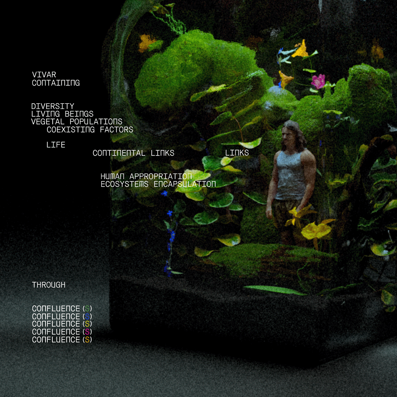
Introducing "CONFLUENCES", which encourages to highlight the diversity of encounters possible among living beings on one hand, through various environments on the other.
"VIVAR" encapsulates five plants with quasi-common biospheres, whose locations diverge across the world. And one Man, Homo sapiens.
Inspired by azuma makoto's Paludariums, "VIVAR" questions the social isolation of human beings in the face of the duality established in parallel with their natural environment. Reminding us that if Nature is isolated and made artificial within a capsule, the human being, by being included in an ecosystem, could experience social isolation in turn.
The first confluence to (re)establish.
This Vivarium is the line drawn between the Natural environment and the rest of the Earthlings, us, the Humans.
Full project presented on my ig (@orgjdd)
Using:
Blender, Polycam, After Effects, Illustrator
Blender, Polycam, After Effects, Illustrator
CURRICULUM VITAE
(personal cv)
(2023)
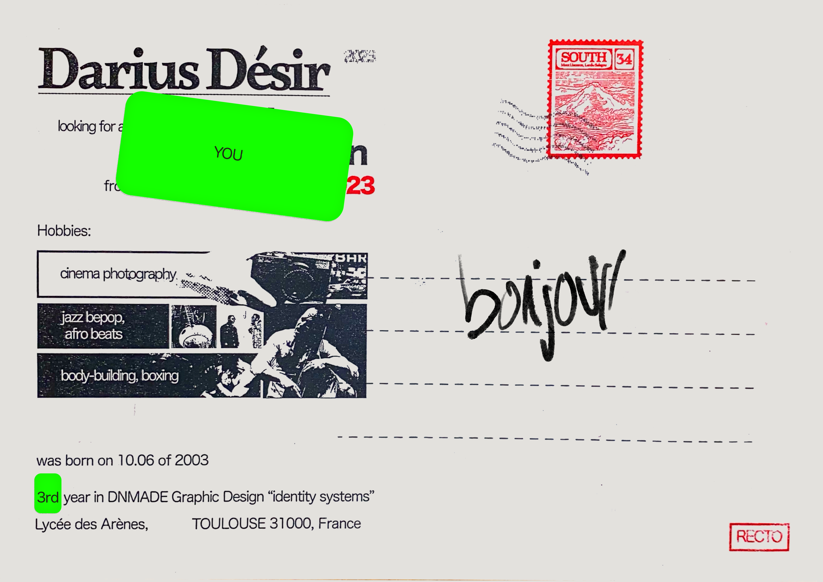
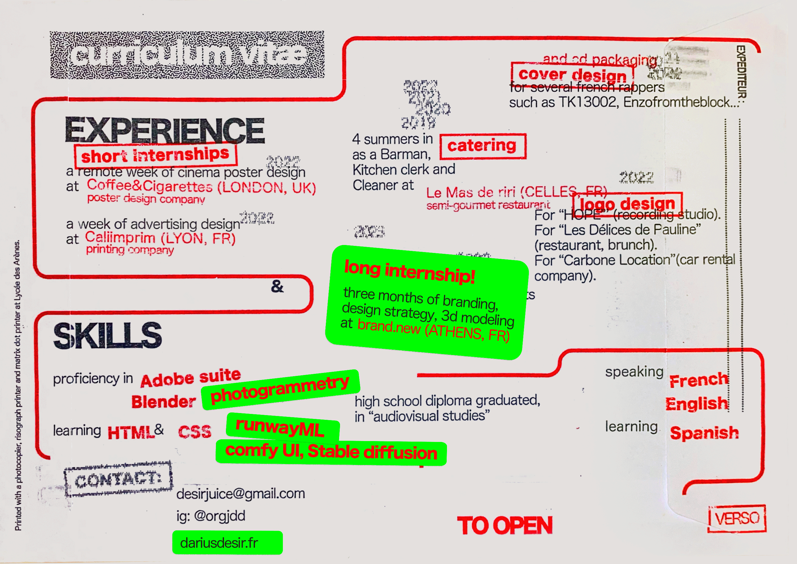
When I announced my internship search for 2023, I wanted to create a CV that would stand out as an object.
The envelope seemed to me to be the ideal format for original mailings.
Here you can observe different 3 printing modes:
Photocopier,
Risograph printer,
Matrix dot printer,
that i managed by myself.
I also wanted to create a "fake" postage stamp with the image of a landscape that was familiar to me, the Salagou lake.
Using:
Matrix-dot Printer, Risograph printer, Photocopier, Adobe Photoshop, Indesign
Matrix-dot Printer, Risograph printer, Photocopier, Adobe Photoshop, Indesign
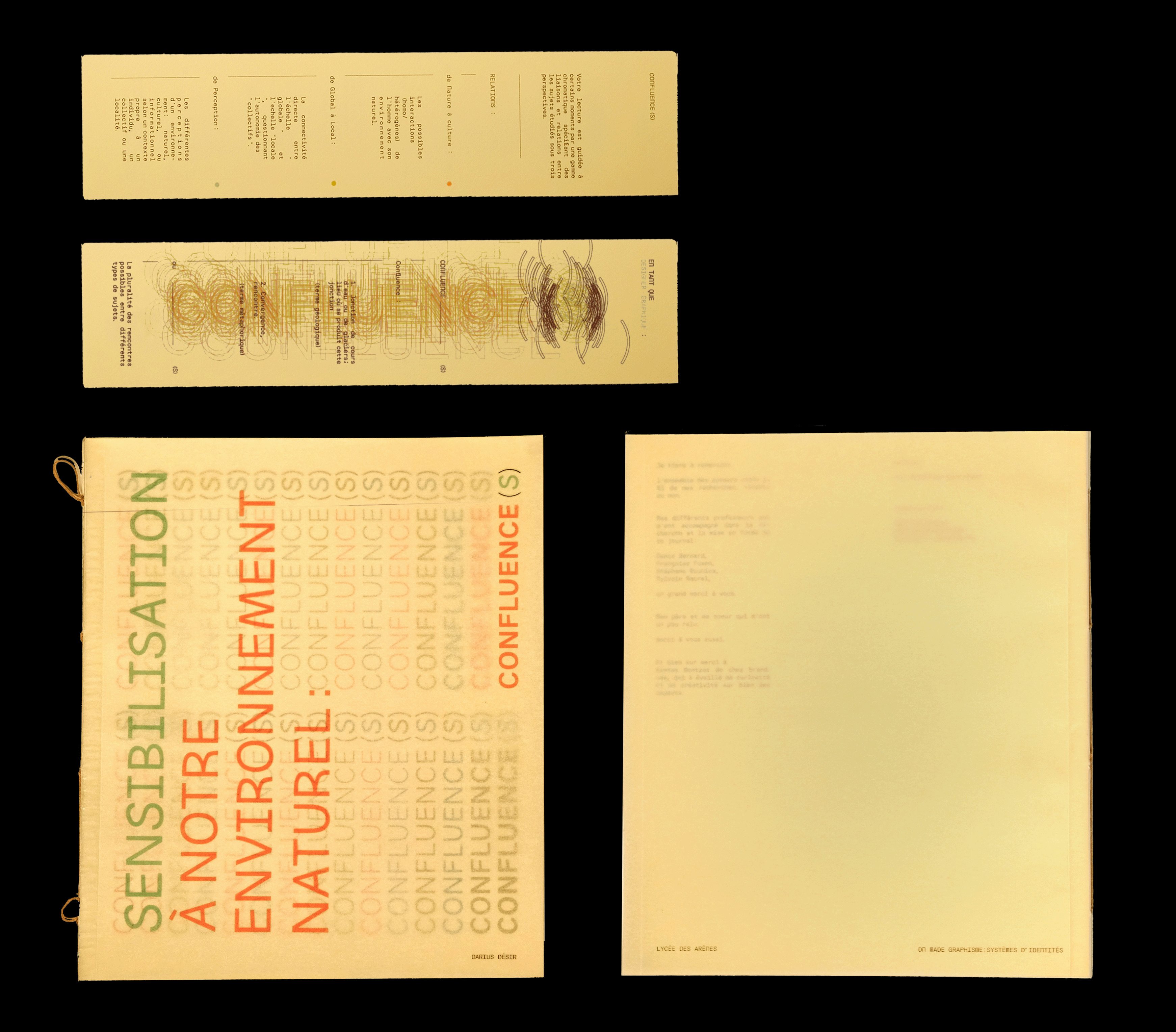
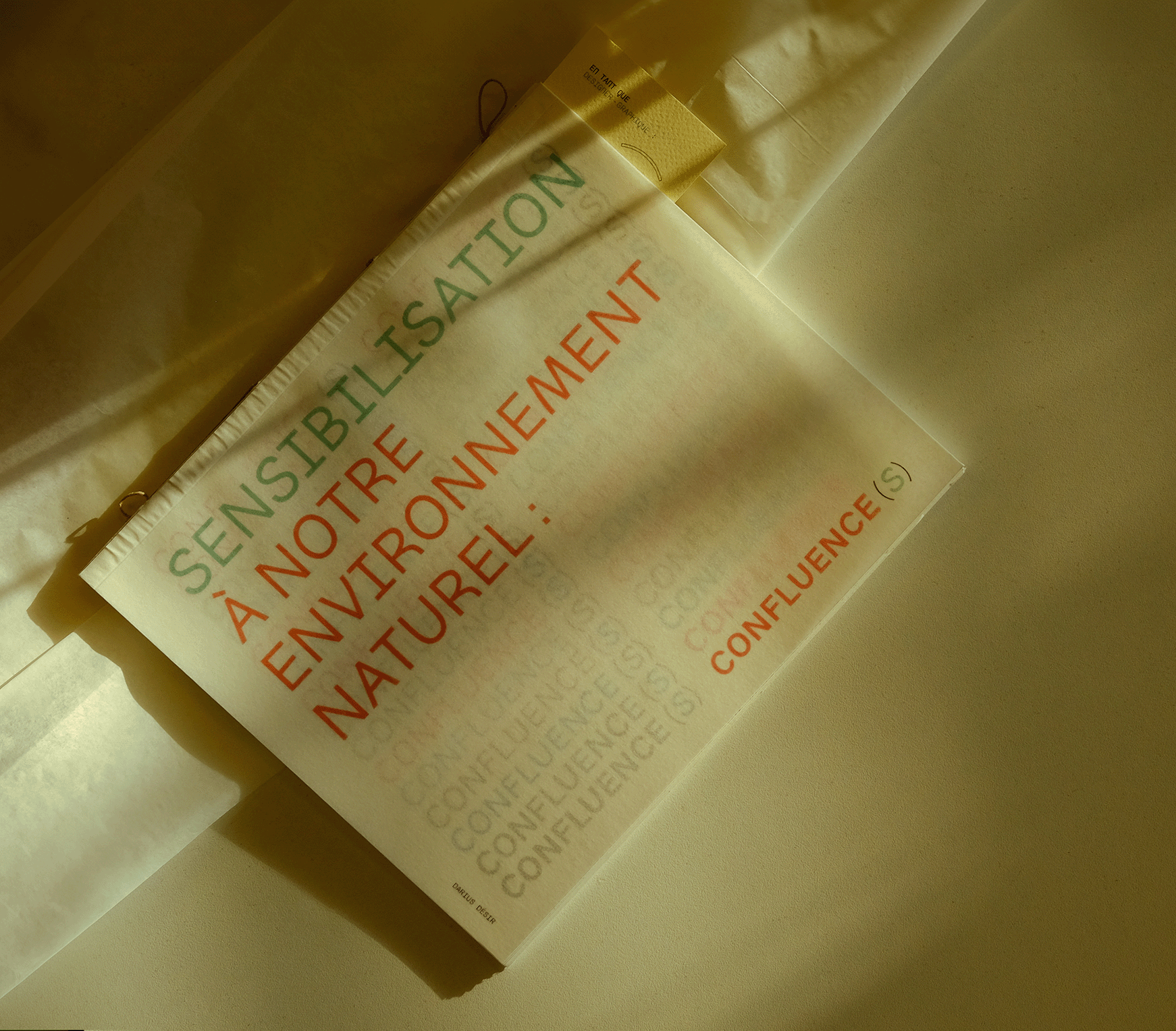
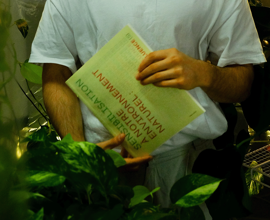
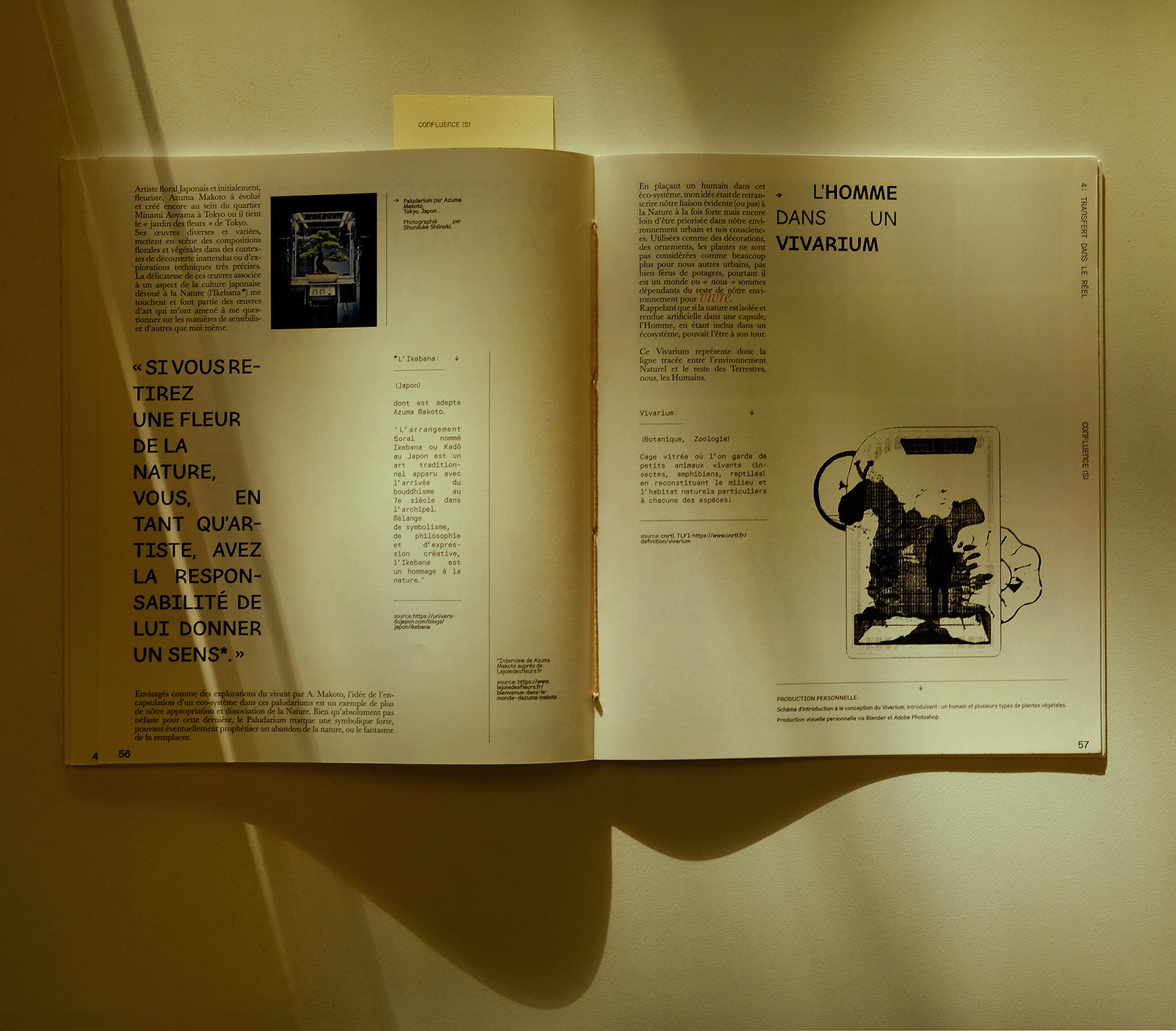
CONFLUENCE(S)
(research journal)
Research Journal, Bachelor's Thesis: "Confluence(s) raising awareness of our natural environment" provides a written account of 5 months of research in attempts to answer the following question:
How can graphic design, through raising awareness and leading to action, help in the confluence of Man and his natural environment?
Several socio-anthropological axes support this research journal, however clumsily they may be transcribed and concretized in relation to graphic design.
pdf available
How can graphic design, through raising awareness and leading to action, help in the confluence of Man and his natural environment?
Several socio-anthropological axes support this research journal, however clumsily they may be transcribed and concretized in relation to graphic design.
pdf available
Laid out using:
Indesign
Printed in Lycée des Arènes, Toulouse, France
Using the fonts:
"Meen" by brand.new,
"Orbit" by Joon Cho & JAMO.
"Baskerville" by John Baskerville.
Indesign
Printed in Lycée des Arènes, Toulouse, France
Using the fonts:
"Meen" by brand.new,
"Orbit" by Joon Cho & JAMO.
"Baskerville" by John Baskerville.

MAINS - DC
(graphic-system, vfx)
(2023)
Graphic identity: crafted and animated for the making of MAINS music video's VFX for Londonian artist DC.
Directed by LX.
Artistic direction by Héléna Milena.
Graphic identity: crafted and animated for the making of MAINS music video's VFX for Londonian artist DC.
Directed by LX.
Artistic direction by Héléna Milena.
Using: Adobe Illustrator, After Effects and Adobe Photoshop

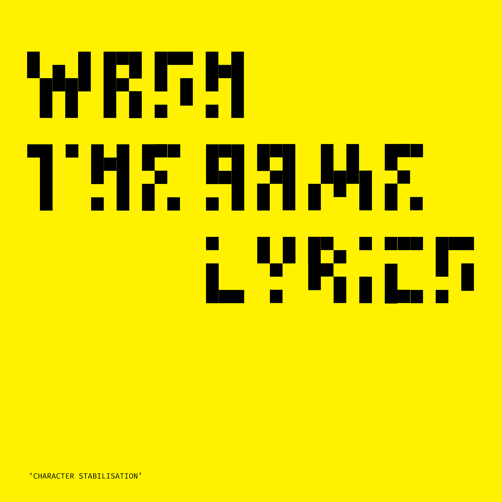
WASHING TAPE
(creative direction, video, photography)
(2023)
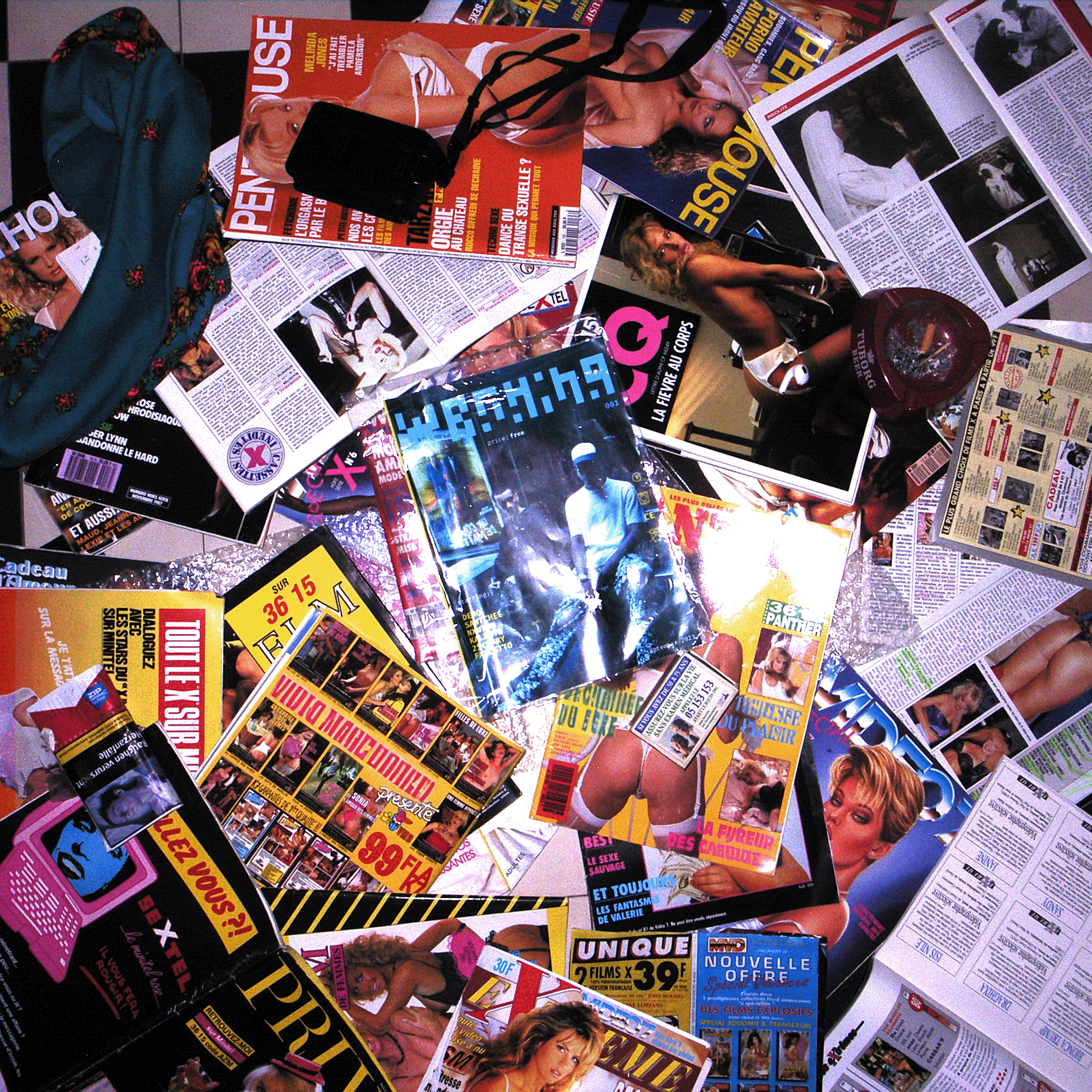
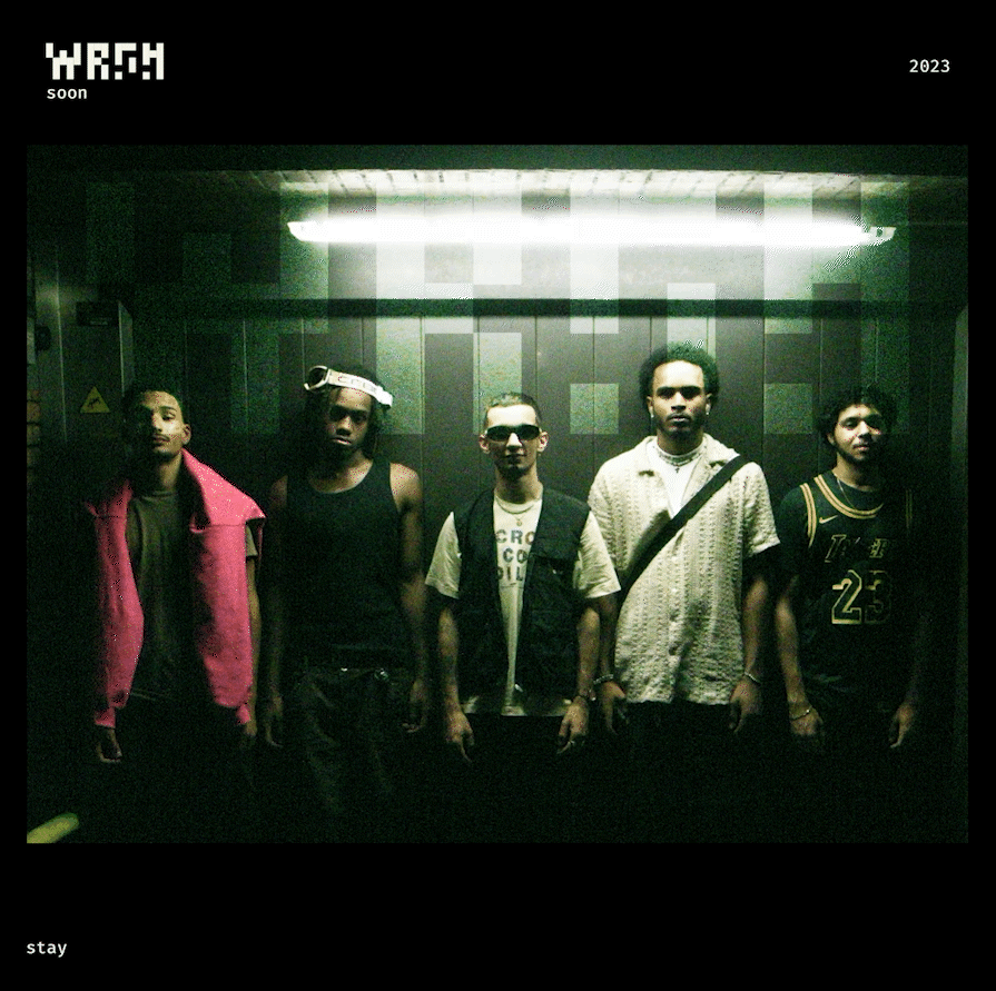
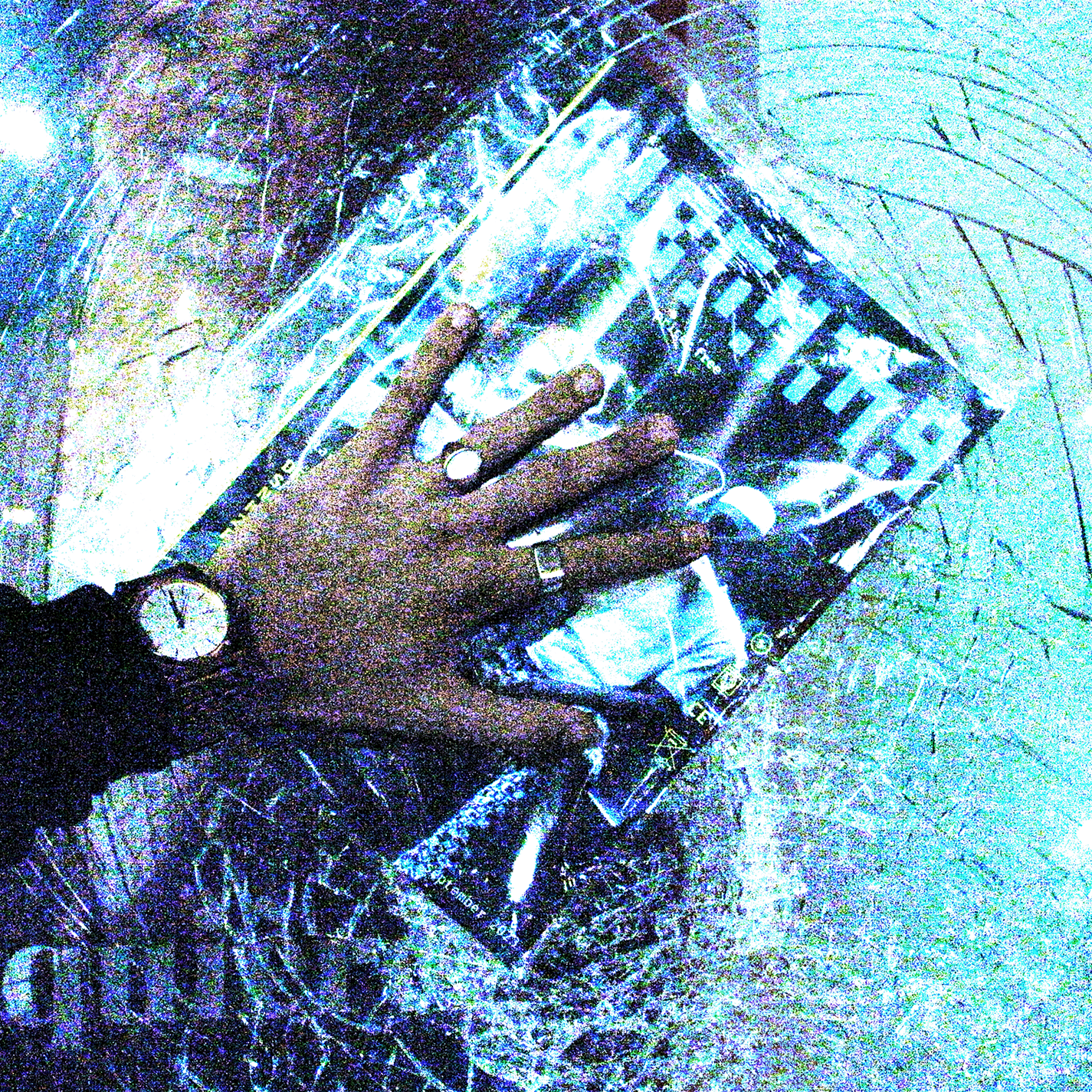
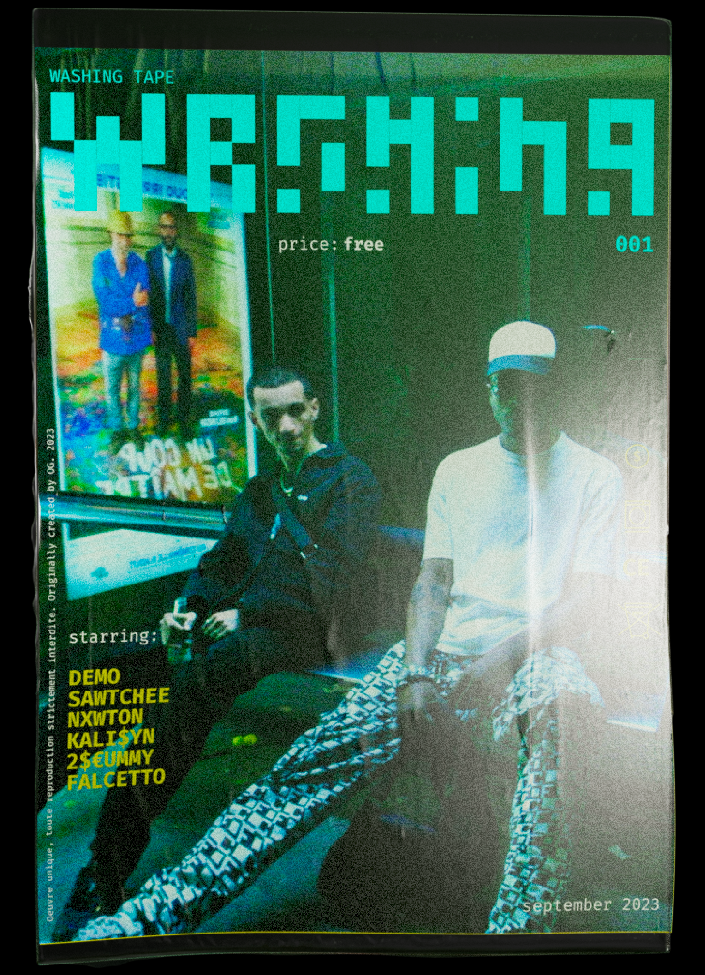
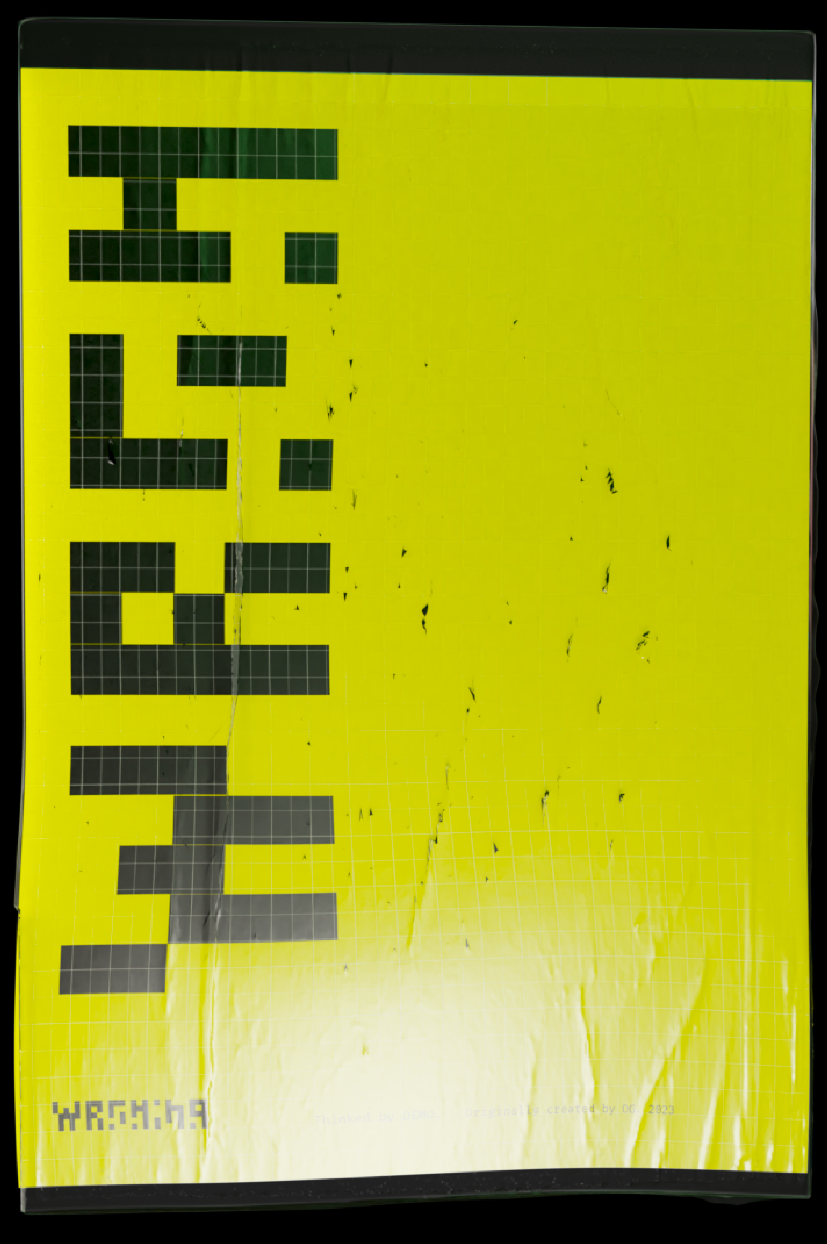
MV direction, photography, typeface creation for WASHING TAPE project identity.
Driven by 90's cinema aesthetics photography, internet culture and 19 years old rapper and producer "DEMO", ambitions and vices. The project showcases a fake magazine as a main artefact, emphasizing the cultural impact that different references (more or less explicitly) had on the artists and myself; through different photographic and typographic layout.
Global artistic and technical direction & execution of the project done by myself with the help of "DEMO".
Using: Ricoh GR I, Iphone 13 Pro, Blender, Photoshop, Indesign, Stable Diffusion XL (:Automatic 1111)
MEEN POWER
(3D animation)
(2023)
Result of an intense photogrammetry, texturing and archiving process, this 3D animation has been crafted for the promotion of brand.new's latest typeface "Meen".
Artisticly directed by Kostas Mentzos.
I've had the opportunity to pursuit a 3 month internship alongside the designer Kostas Mentzos at brand.new design studio in Athens, Greece, a really human, creative and solid experience for my creative path.
Using: Blender, Photogrammetry

WHOAMI?
(photographic research)
(2023)
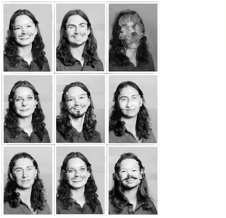
Experiment and research while De-and Re-noising img2img from my last class photo.
Experiment and research while De-and Re-noising img2img from my last class photo.
Using:
Stable Diffusion 2.1 model, comfyUI, Adobe Photoshop
Stable Diffusion 2.1 model, comfyUI, Adobe Photoshop

KANEDA
Logotype
(2023)
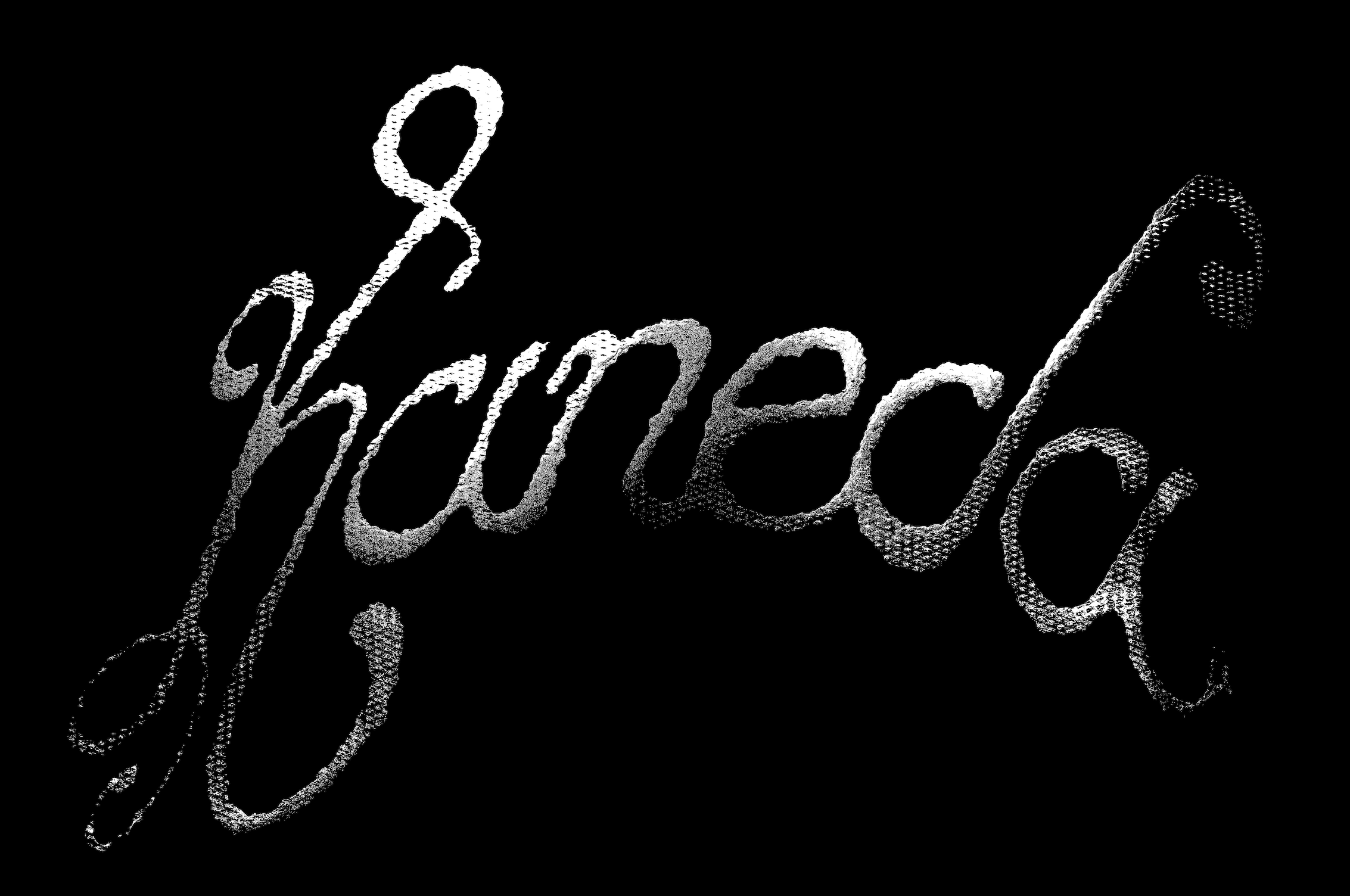
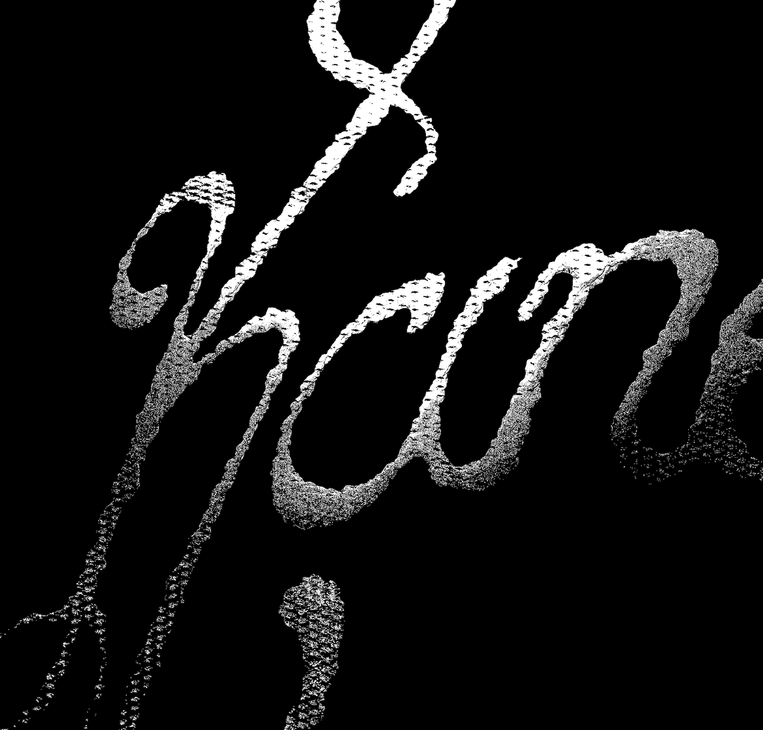
Hand-written logotype crafted for the rebranding of Kaneda, the beatmaker's visual identity.
Hand-written logotype crafted for the rebranding of Kaneda, the beatmaker's visual identity.
Using:
Procreate, Adobe Illustrator, Adobe Photoshop
Procreate, Adobe Illustrator, Adobe Photoshop
BURN OUT
(music video typeface)
(2023)
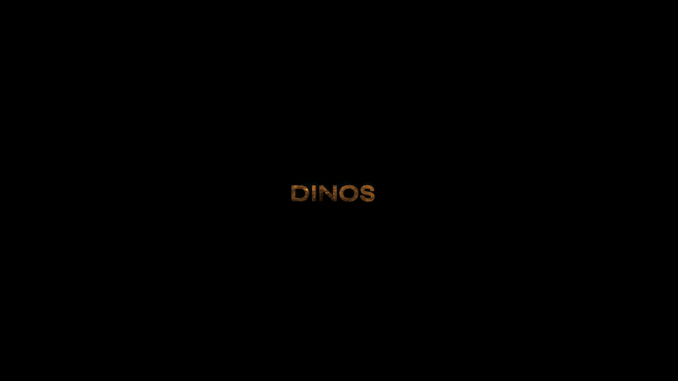
Typeface expressively created and animated for the intro titling of french rapper Dinos's music video
"Burn Out", dropped for "CREED 3"'s movie promotion.
Produced by Warner Bros; Directed by Pietro Biz Biasia
Typeface expressively created and animated for the intro titling of french rapper Dinos's music video
"Burn Out", dropped for "CREED 3"'s movie promotion.
Produced by Warner Bros; Directed by Pietro Biz Biasia
Using: Brush, China ink, Adobe After effects.
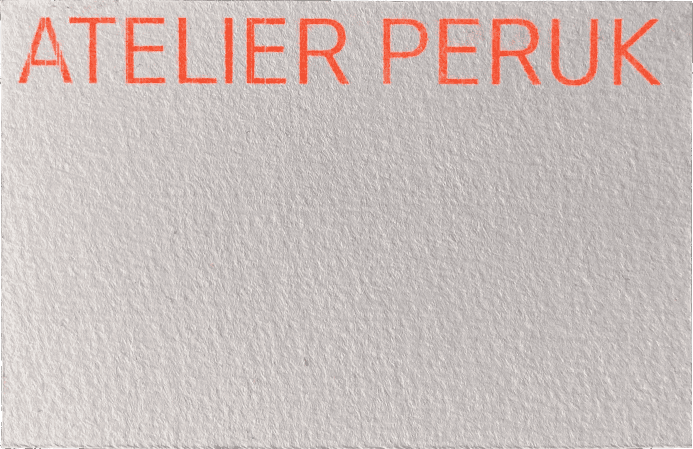
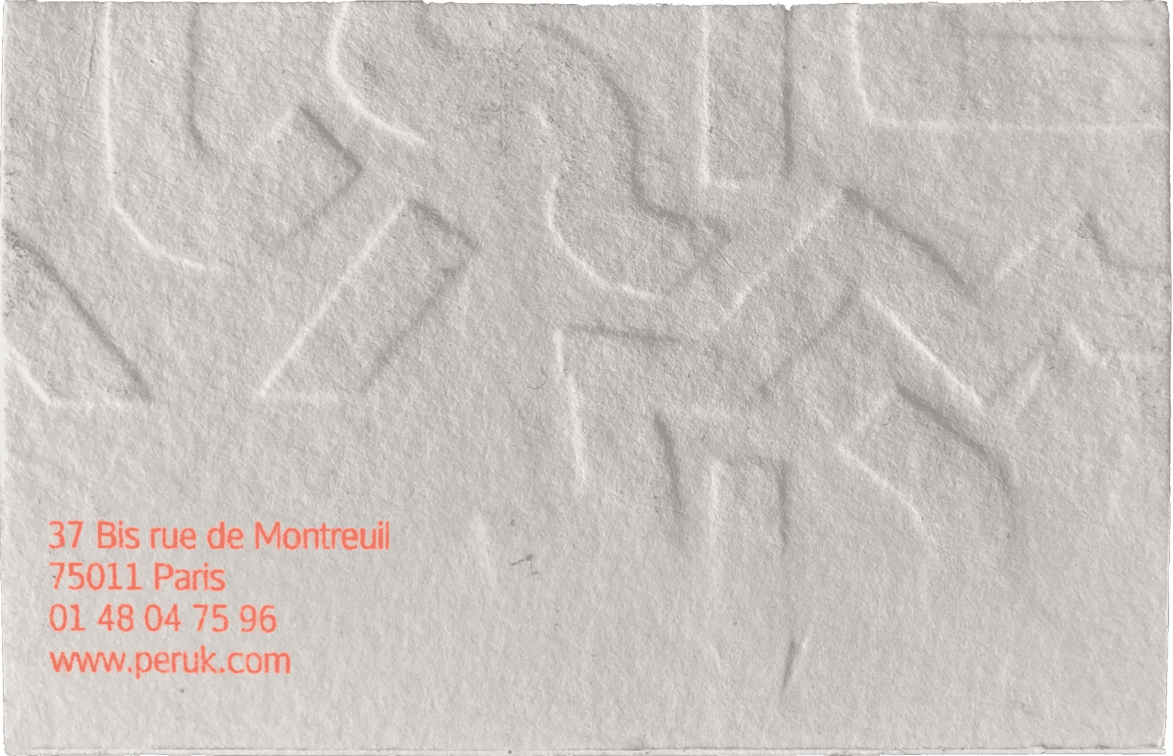
ATELIER PERUK
(fictive business card design and shaping)
(2022)
Creation of a fictional business card for "ATELIER PERUK", a fictional Parisian wigmaker. Project thought on Procreate then embossed and risographed at Lycée des Arènes.
Creation of a fictional business card for "ATELIER PERUK", a fictional Parisian wigmaker. Project thought on Procreate then embossed and risographed at Lycée des Arènes.
Using: Risograph printer,Tetrapak materials, Rotary-press, Procreate
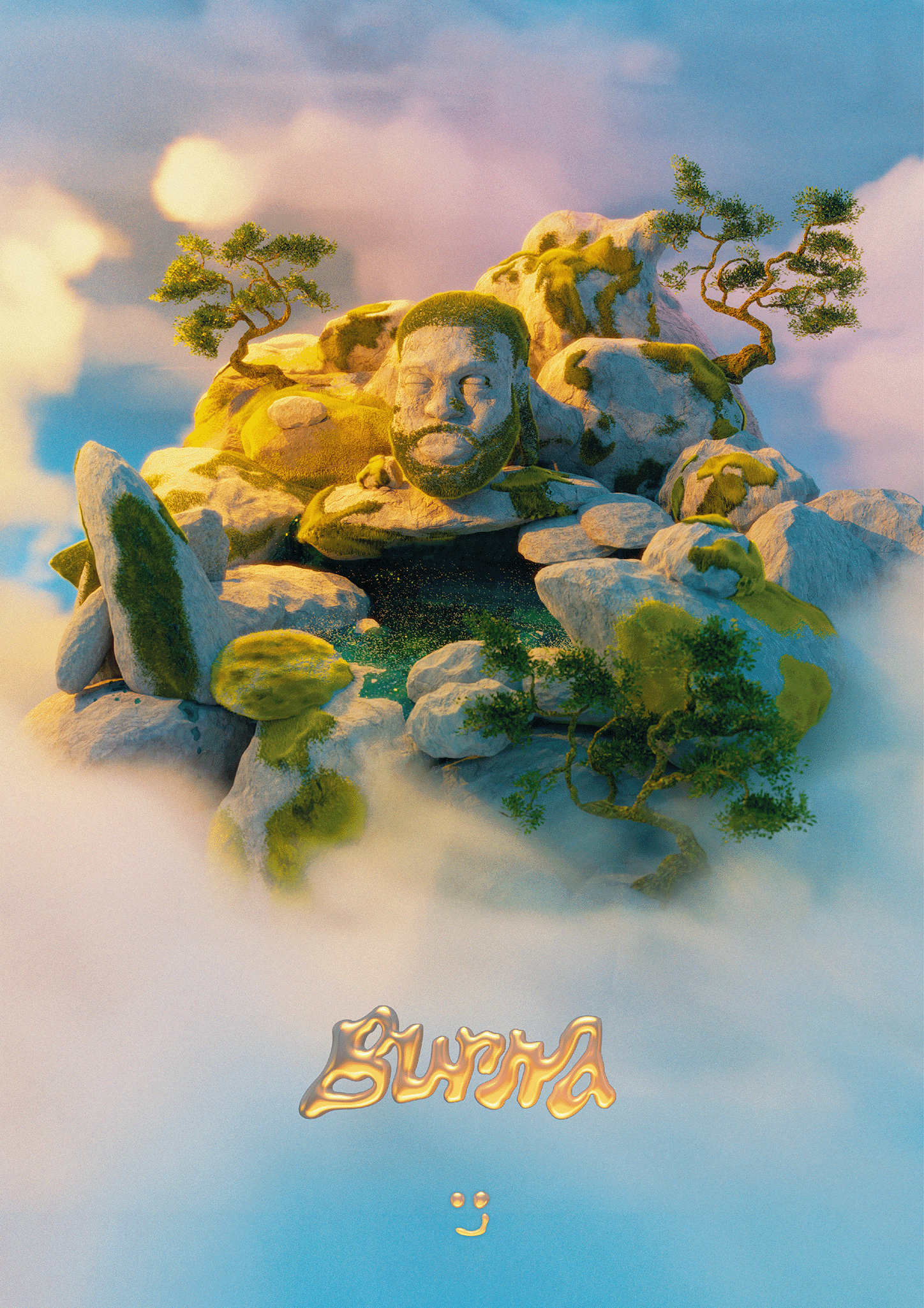
SCULPTED BURNA BOY
(3D modelisation)
Fictive representation of nigerian artist, BURNA BOY.
The bust, trees and rocks are sculpted or modelized.
Typography selfmade throughout different softwares.
The bust, trees and rocks are sculpted or modelized.
Typography selfmade throughout different softwares.
Using: Blender and photogrammetry
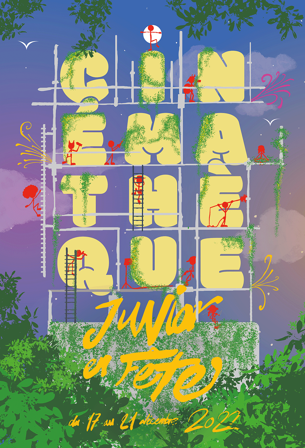
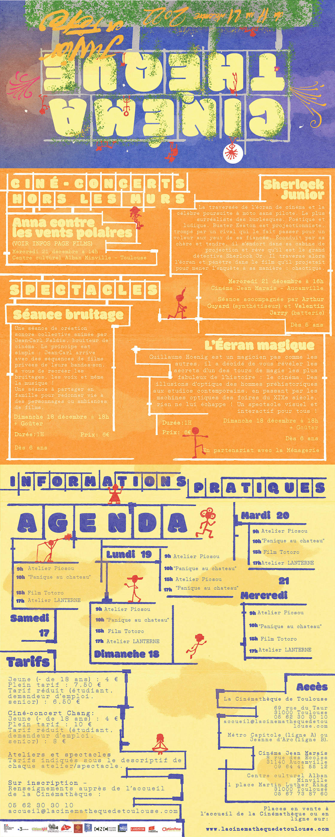
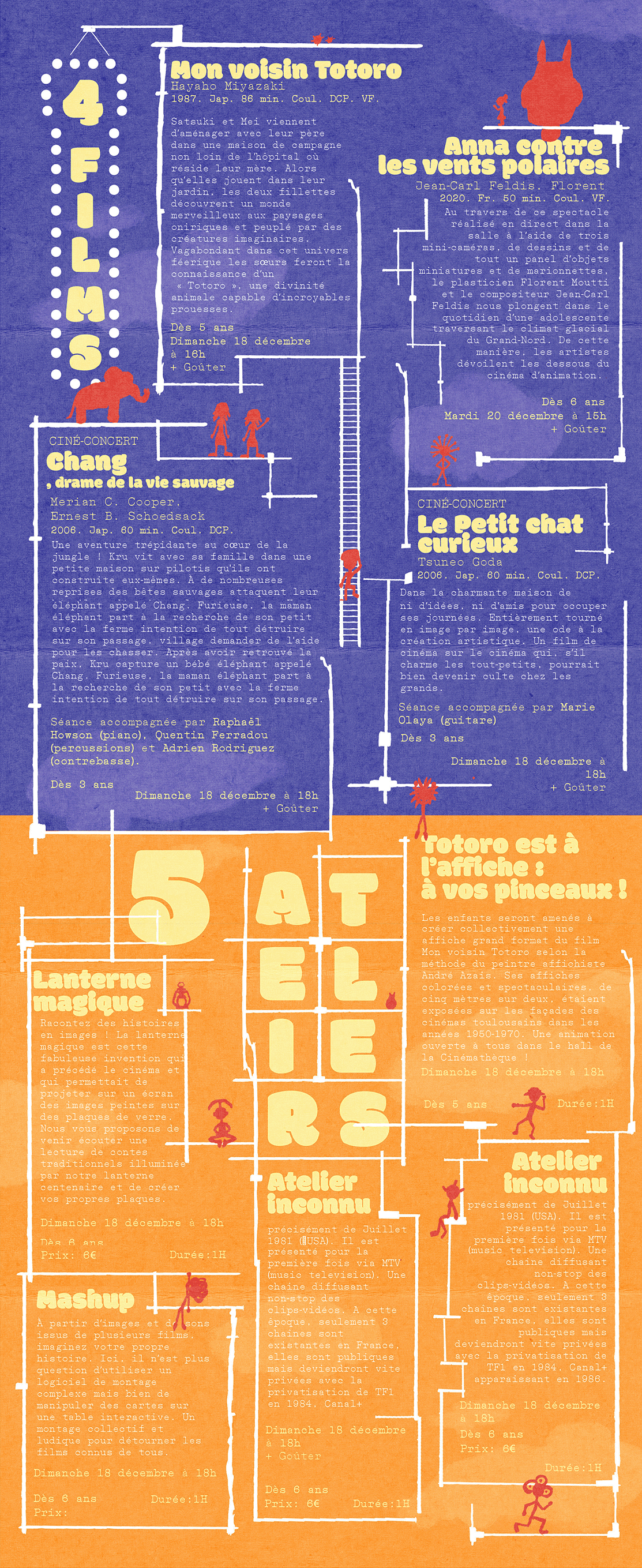
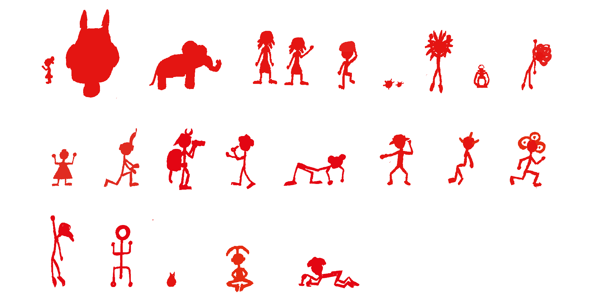

CINÉMATHÈQUE JUNIOR EN FÊTE
(identity system)
(2022)
Poster creation project declined in fictitious identity for the festival "La Cinémathèque junior en fête", for the Cinémathèque de Toulouse. Find next the poster and leaflets related to the projects and connected by a system of scaffolding and constructive typography.
Nature is dying faster and faster, the ecological crisis that the earth is undergoing asks, at my sense, to highlight his qualities
The entire identity is thought to be travelled in, unveiled little by little it arouses curiosity, the leaflet is an object that can reinforce this feeling with children in particular.
Using: Procreate, Adobe Photoshop, Indesign, Illustrator

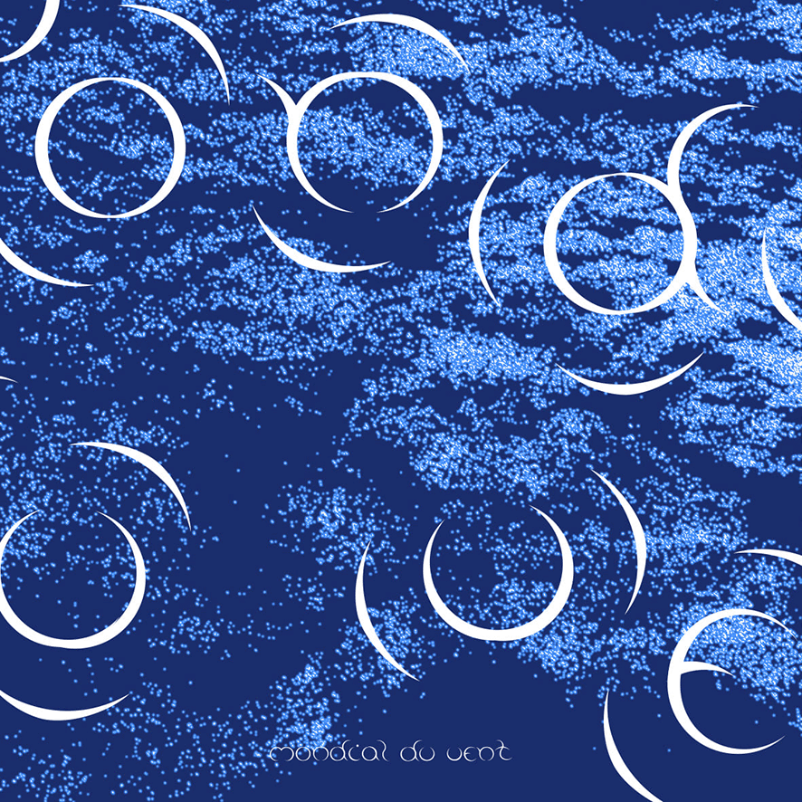

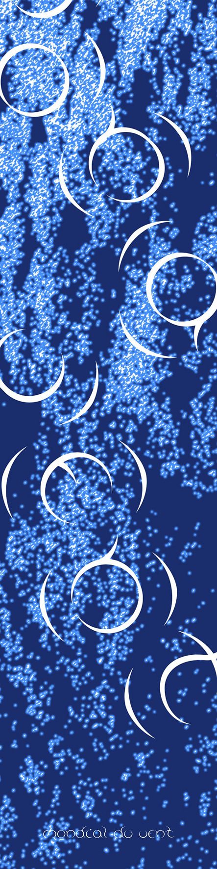
MONDIAL DU VENT 2023
(typography system)
Fictitious identity system for the Leucate's Mondial du vent 2023 edition.
This identity includes two flags in the 100x100 cm and 50x200cm formats as well as a typographic work for the main typeface.
My flags are working systematically by superimposing shapes (ventus + aqua), one on top of the other they give off fluidity, dynamics and light summer of windy and watery elements.
For this typeface, I experimented shapes with my letters, to try to have something that would simply look like wind as an additional design on the flag.
Using: Adobe Photoshop
TRUMPET TIME
(motion design animation)
Motion tribute to Elaine and Saul BASS.
Co-realized with Maxime JACQUOT during a 3 days animation workshop.
Co-realized with Maxime JACQUOT during a 3 days animation workshop.
Using: Adobe Illustrator, After Effects and Procreate
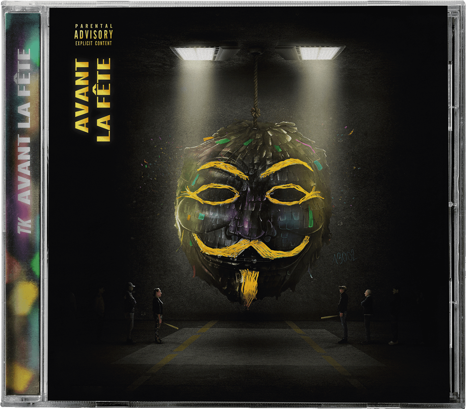
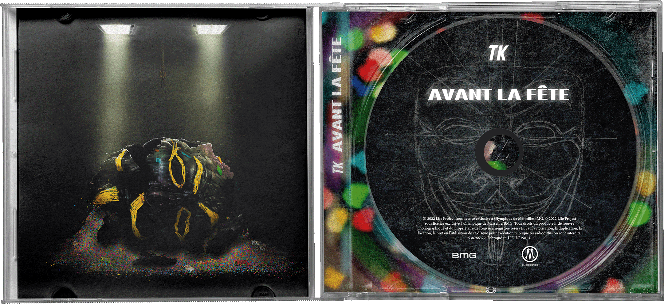
AVANT LA FÊTE
(cover design, artistic direction)
(2022)
Cover, Tracklist, and artworks extracted from the packaging of TK's "Avant la fête" project.
The cover artwork have entirely been created on photoshop, using stock images and pictures of my surroundings for the waiting characters.
I made all the visuals included in the CD for this project.
Cover, Tracklist, and artworks extracted from the packaging of TK's "Avant la fête" project.
The cover artwork have entirely been created on photoshop, using stock images and pictures of my surroundings for the waiting characters.
I made all the visuals included in the CD for this project.
Using: Adobe Photoshop, Indesign


BOOGIE WONDERLAND
(font creation)
This character is the result of several days of trying to stabilize a typography character, during a school workshop. I named it "BOOGIE WONDERLAND" for his lack of coherence.
Using:Adobe Illustrator
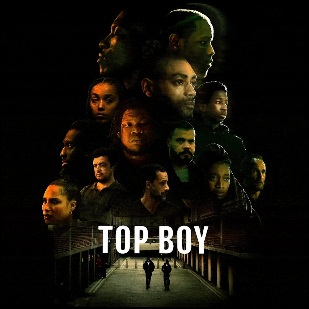
TOP BOY S3 POSTER
(fictive poster design)
(2022)
Like every season, I was carried away by the images and acting of the London series Top Boy. The work of colors and lights offered by this show are part of what I currently admire the most for their immersiveness and correspondence to the scenes. I tried to pay a (very small) tribute to this gigantic work of the directors of photography on my scale via Photoshop with a small recap of the main characters of the series.
Like every season, I was carried away by the images and acting of the London series Top Boy. The work of colors and lights offered by this show are part of what I currently admire the most for their immersiveness and correspondence to the scenes. I tried to pay a (very small) tribute to this gigantic work of the directors of photography on my scale via Photoshop with a small recap of the main characters of the series.
Using: Adobe Photoshop